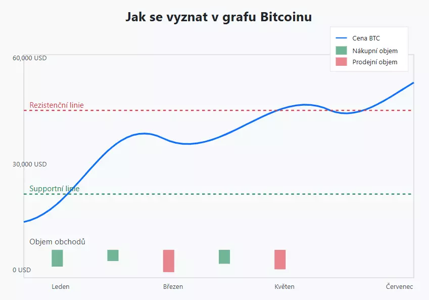
A crypto chart looks at first glance exactly like a stock chart: time left to right, price bottom to top, green and red rectangles. Most of what you learn about candles really does apply everywhere in the same way.
A few things are different with crypto, though, and those are what decide whether two charts of the same coin show you two different numbers. Trading never stops, every exchange keeps its own order book, and the price range over ten years is so wide that an ordinary scale stops working.
Three chart types and why candles won
Price can be drawn three ways. A line chart connects closing prices only — it is the cleanest and works when you want the shape of a trend without the noise. A bar chart (OHLC bars) already shows all four prices of a period. A candlestick chart shows the same as a bar chart, but with a filled body between the open and the close, so the direction is obvious from the colour alone.
That last part is what settled it. On a candlestick chart you can see at a glance where the market was decisive and where it hesitated, without reading a single number. The rest of this article is about candles.
What is on the screen when you open a chart
The layout differs between platforms, but the elements are almost always the same. This is Bitcoin on TradingView, where you can follow it for free:
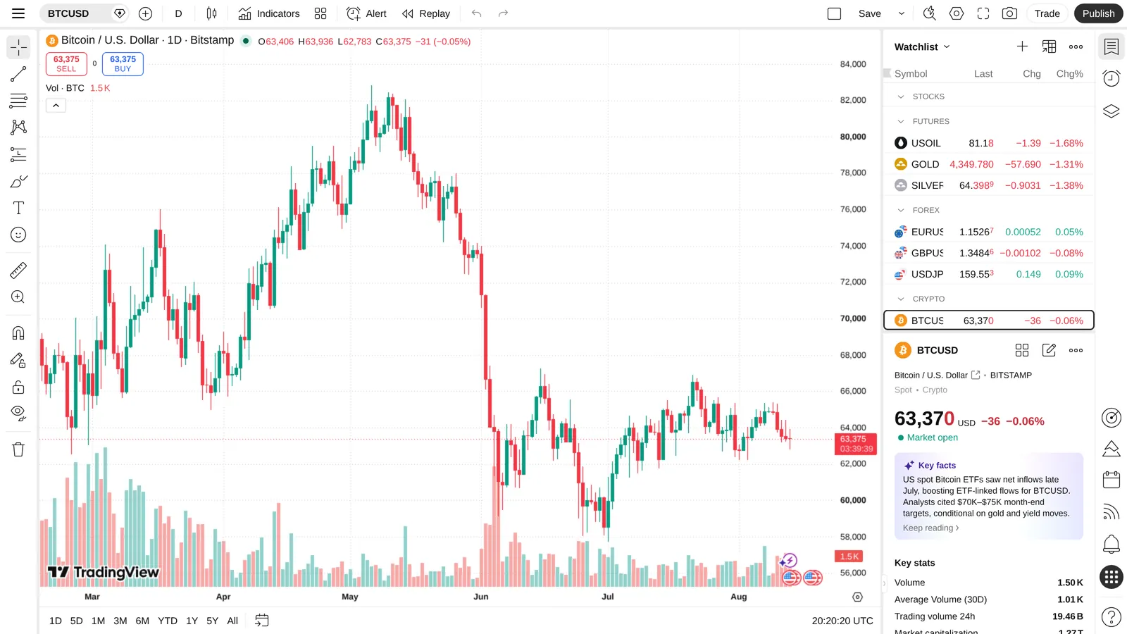 Daily BTC/USD chart from the Bitstamp exchange, captured on 13 August 2026. Source: TradingView.
The chart header tells you what you are actually looking at: the pair Bitcoin / U.S. Dollar, the 1D timeframe and the Bitstamp exchange. Next to it run the four values O, H, L, C with the prices of the latest candle and the change against the previous close — exactly the four prices we take apart in a moment.
The price axis on the right highlights the last price and shows a countdown below it. That countdown matters more in crypto than it looks: the market has no closing bell, so the only thing telling you when the daily candle ends is that timer — and the clock in the bottom right corner, which runs in UTC.
Volume is the histogram under the price, with bar colours matching the candles. It applies only to the one exchange the chart comes from.
The time axis and range buttons at the bottom (1D, 5D, 1M through All) change how long a period fits in the window. Do not confuse them with the candle timeframe, which is set at the top — five years of daily candles is a different chart from five years of weekly ones.
The panel on the left holds the drawing tools: trend lines, Fibonacci levels, notes. The right-hand column is the watchlist and basic statistics — for Bitcoin, things like 24-hour volume and market capitalisation.
What a single candle says
Every candle covers one slice of time and carries four prices, marked internationally as O, H, L, C — open, high, low, close. The body of the candle is the range between the open and the close; the thin wicks above and below reach to the highest and lowest price traded in that slice.
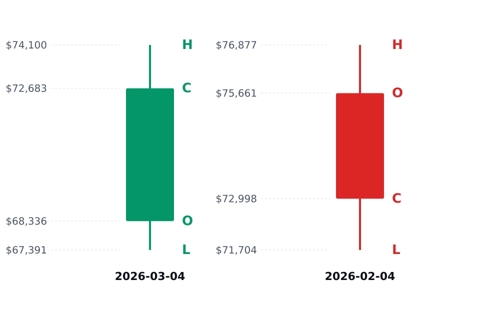
On the left is Bitcoin’s actual day on 4 March 2026: it opened at 68,336 dollars, spiked to 74,100, dropped to 67,391 and closed at 72,683. Because the close ended above the open, the candle is green and the opening price is the bottom edge of the body. On the right is 4 February 2026, when the market opened at 75,661 and closed lower, at 72,998 — the candle is red and the opening price is the top edge instead. This is where people get it wrong most often: on a green candle the close is on top, on a red one the open is.
A long body means one side had the upper hand between the open and the close. A long wick, by contrast, says price got somewhere and could not hold it — the market pulled it back. A short body with wicks on both sides is indecision.
Timeframe: what each candle means
The same chart looks completely different depending on how long a slice one candle covers. The choice of timeframes varies by platform, but in practice three groups get used:
| Timeframe | One candle | What it is good for |
|---|---|---|
| 1 min to 30 min | minutes | timing an entry, watching the reaction to news |
| 1 h to 8 h | hours | short-term trading across a few days |
| 1D, 1W, 1M | a day to a month | market direction, support and resistance, long holds |
One rule saves a lot of mistakes: work top down. Look at the weekly and daily chart first, so you know which way the market is going at all, and only then zoom in. Start on a five-minute chart and you will see plenty of movement without knowing whether it is a trend reversal or noise inside the day.
How a crypto chart differs from a stock chart
Trading never stops. A stock exchange has an opening and closing bell, so the chart develops gaps — overnight and over the weekend. Cryptocurrencies trade 24 hours a day, seven days a week, and the chart runs without a break. The exception is Bitcoin futures on the CME, which have sessions like a traditional exchange, so their chart does show weekend gaps.
The daily candle boundary is only a convention. With no closing bell, the exchange has to cut the day somewhere. Data from the public interfaces of both Binance and Coinbase have daily and monthly candles aligned to midnight UTC. Some platforms let you pick your own time zone, though — and then the same coin has its days cut differently and its formations look different, without a single trade having changed.
The weekend is a different market. Volumes are lower, the order book is thinner, and an order of the same size moves price further. Candles from Saturday and Sunday are therefore not directly comparable with Wednesday’s.
Which exchange are you actually looking at
Cryptocurrencies have no central exchange with one official price. Every venue keeps its own order book, so there are as many Bitcoin charts as there are places it trades. Before you start reading a chart, it should be clear what its header says:
Which pair. BTC/USD is bitcoin against the dollar, BTC/USDT against the stablecoin Tether, BTC/EUR against the euro. These are different instruments with their own liquidity and their own price. Differences tend to be small, but they grow on less liquid coins.
Which exchange. The price on two venues never matches to the cent — that is why arbitrage traders exist. When comparing your chart with what someone else sees, check first that you are both looking at the same exchange and pair.
Spot or perpetual. Alongside the spot market, crypto trades heavily in perpetual futures. They have their own chart and their own price, kept near spot by the funding paid periodically between long and short positions. Formations on perpetuals can therefore differ from spot.
Volume. The volume bars under the chart apply only to the exchange the chart comes from. Aggregated volumes from different sources cannot be compared with each other, and on smaller venues their reliability is debatable.
Linear or logarithmic scale
This matters more with Bitcoin than with almost anything else. On a linear scale every thousand dollars has the same height, so a move from 5,000 to 10,000 dollars — a doubling — looks like a twitch along the bottom, while a move from 100,000 to 105,000 takes up just as much room. On a logarithmic scale every doubling has the same height, so the chart shows percentage change.
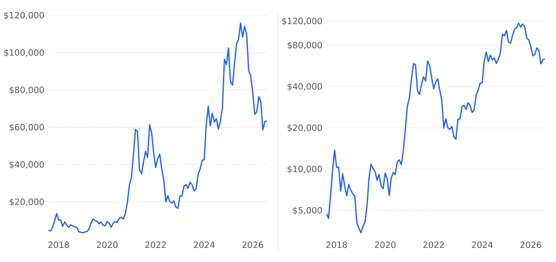
Left and right hold the same series of monthly closing prices. On the linear chart the whole period up to 2020 is squeezed into a line at the bottom and tells you nothing. On the logarithmic one you can see those moves were comparable in percentage terms with the later ones. On any chart longer than two years, switch to the logarithmic scale; for short-term trading it makes no difference.
Working with the chart in practice
Start with direction. On the daily or weekly chart, check whether the market is making higher highs and higher lows, the opposite, or holding in a range. Only then drop to a shorter timeframe.
Mark the levels where price has already stopped several times. Support and resistance are more reliable the longer the timeframe that drew them — a level from the weekly chart holds up better than a line from a fifteen-minute one.
Watch the volume below the chart. A break through a level on high volume carries different weight from the same break on volume lower than usual.
Read formations in context, not on their own. A single candle is not a signal — it means something only within a running trend and at a level that matters. We cover them separately in bullish and bearish candlestick patterns, and the current price with a chart is on the Bitcoin price page.
Above all: the chart is only one input into a decision. Without rules for position size and a stop-loss, even perfect reading produces nothing good.
The charts in this article are drawn from public exchange data — monthly BTCUSDT candles from the Binance interface and daily BTC/USD candles from the Coinbase Exchange interface, retrieved on 13 August 2026.