
The golden cross is one of the best known technical indicators in the financial markets. It is a bullish signal that appears when a short-term moving average crosses above a long-term moving average. It can mark a shift in trend from bearish to bullish.
The usual setup is a combination of the 50-day and the 200-day simple moving average (SMA). When the shorter average cuts above the longer one, you get what traders call a golden cross. A minority runs the same calculation on exponential averages (EMA) — the difference between the two versions is covered below.
Once a golden cross shows up, plenty of investors start buying in anticipation of a longer advance. That creates a snowball effect — the more market participants react to the cross by buying, the stronger the bullish trend that follows. The rising price then draws in further investors who do not want to miss out, which pushes the trend along again.
Setting up a chart to track the golden cross
To follow the golden cross you first need to set up the chart in your trading platform. In most broker apps and platforms (TradingView, MetaTrader or xStation, for example) moving averages sit in the indicator section, usually listed as “Moving Average” or “EMA”.
To display the golden cross pattern you add two exponential moving averages (EMA):
- The first with a 50-day period (the short-term average)
- The second with a 200-day period (the long-term average)
In the sample chart below you can see both averages already in place — the green line is the 50-day EMA (value 14.00) and the orange line is the 200-day EMA (value 10.17). Give each average a different colour so that the moment they cross is easy to spot.
Once the two averages are set up, you can start watching how they interact and look for potential golden cross signals. Most platforms also let you set an alert on the crossover, so the moment does not slip past you.
SMA, or EMA?
The classic definition of the golden cross works with the simple moving average (SMA) — the plain arithmetic mean of the last 50 and 200 closing prices. That is how screeners have it set up (StockCharts lists it in its scan library directly as a cross of the SMA 50 above the SMA 200), and that is what the financial press means when it reports that an index has produced a golden cross.
The exponential version (EMA), the one used in the chart below, is legitimate — Fidelity teaches it, among others — it just is not the default. The practical difference is a trade-off between speed and calm: the EMA puts more weight on recent prices, so the signal arrives sooner, but according to Charles Schwab it also shakes you out on a false break more often. The SMA has a built-in lag that smooths the moves out, which suits a long-horizon 50/200 signal better.
Whichever you pick, it is worth knowing that it is still the same lagging signal — the type of average does not solve the false-crossover problem, it only shifts the balance between speed and reliability.
How to spot a golden cross on a chart
Identifying a golden cross starts with two moving averages — one short-term, one long-term. On the chart of Sofi Technologies (SOFI) below, these are drawn as a green line for the 50-day EMA and an orange line for the 200-day EMA. What matters is the point where they cross.
The golden cross itself happens the moment the short-term average crosses above the long-term one. On this chart it came in September 2024, marked clearly by the green rectangle and the “Golden cross” label. That moment was the start of a strong advance, during which the share price climbed from around $8 to roughly double that over the following months.
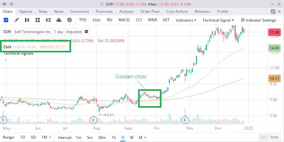 The golden cross is a technical indicator that signals a possible start of an uptrend in a stock, when a short-term moving average (the 50-day, say) crosses above a long-term moving average (the 200-day).
What to look for when identifying a golden cross on a chart:
-
The short-term moving average (EMA 50) — the green line on the chart
-
The long-term moving average (EMA 200) — the orange line on the chart
-
On the SOFI chart, the green line (EMA 50) cuts above the orange line (EMA 200) in September 2024
-
The crossover is highlighted by the green rectangle and the “Golden cross” label
-
At the bottom of the chart you can see trading volume picking up around the crossover
Confirming a golden cross
Several things are worth checking before you treat the signal as valid. The first is how clean the crossover is — the averages should cross plainly, not merely touch. After the cross they should start pulling apart, which confirms the strength of the new trend. On the SOFI chart you can see the green line (EMA 50) genuinely moving away from the orange one (EMA 200).
Trading volume
Volume, shown at the bottom of the chart, matters just as much. Higher volume around the crossover lends the signal credibility. With SOFI, trading activity picked up as the averages crossed, which helped confirm the signal.
What followed on the SOFI chart shows the pattern at its best. After the crossover the price rose steadily in a clear uptrend, with the short-term average (green line) staying above the long-term one (orange line) — further confirmation that the trend was holding.
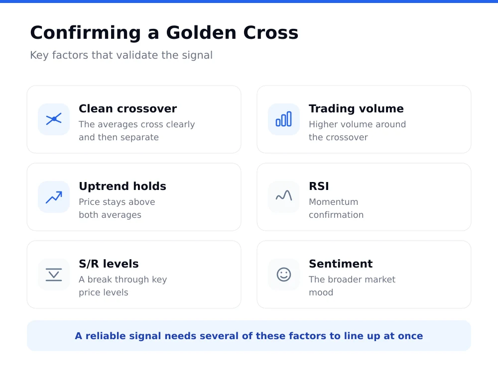 Reading a golden cross reliably means watching several factors alongside the crossover itself.
As the SOFI example shows, spotting the pattern early can mean catching a sizeable move. Even so, the signal should always be combined with other indicators and with a proper look at the instrument itself.
Putting it to work in trading
To get more out of a golden cross, pair it with other indicators. You can watch, for instance:
- RSI (Relative Strength Index) to confirm momentum
- Support and resistance levels
- Trend lines
- Candlestick patterns
The golden cross works best on liquid, larger-cap markets — the main equity indices (S&P 500, NASDAQ), blue-chip shares or widely traded currency pairs. The horizon for trading after a golden cross is usually medium to long term, typically months rather than weeks.
The golden cross is not confined to equities — the pattern can be used across all the main financial markets:
- Forex (currency pairs) — mainly the majors such as EUR/USD, GBP/USD, USD/JPY
- Commodities — gold, silver, oil, agricultural commodities
- Cryptocurrencies — Bitcoin and other large coins
- Equity indices — S&P 500, NASDAQ, DAX
- Individual shares — above all liquid blue chips
On all of these markets the golden cross can help flag a potential long-term uptrend. Because the main instruments are highly liquid, the signals tend to be reasonably dependable, and traders often combine them with other technical indicators to confirm the trend.
Time frames for the golden cross
The golden cross is a fairly rare pattern — on a single stock or index it may show up only once in several years. On the S&P 500 it has long worked out at roughly one golden cross every two years: the research service CXO Advisory counted 34 of them on daily index data between January 1950 and May 2017, while Carson Group puts the tally at 36 from 1950 to February 2023. That rarity is what makes it worth a look when it finally appears.
Time frames for tracking the golden cross:
- Daily chart — the most widely used time frame, giving dependable signals for medium and long-term trading
- Weekly chart — used to identify genuinely strong long-term trends; signals are rarer but often more reliable
- Four-hour chart (4H) — suited to shorter-term trading, but it produces more false signals
- Hourly chart (1H) — not much use here, it generates a lot of noise and false signals
For most investors the daily chart is the place to watch, where the 50-day and 200-day EMA give the steadiest signals. The weekly chart can serve as extra confirmation of the trend, while shorter time frames are better for timing a specific entry than for spotting the pattern in the first place.
The shorter the time frame, the more false signals you can expect. That is why most long-term investors stick to daily or weekly charts for this pattern.
Risks, limits and false signals
Technical analysis throws up false golden cross signals too, and they can lead to poor decisions. They typically show up in periods of high volatility or during a sideways trend. To cut them down, watch the confirming factors: rising volume, price action holding above the main support and resistance levels, and overall market sentiment.
For all its popularity, the golden cross is not a flawless indicator. Its main limitation is that it is a lagging indicator — the signal arrives only once the trend has already begun to turn. In fast-moving markets that delay can be a problem.
What actually happened after the signal
The track record of the golden cross looks good at first glance. CXO Advisory calculated that six months after the signal the S&P 500 was on average 6.4% higher and positive in 79% of cases; Carson Group reports that a year after the signal the index was higher in roughly 78% of cases, with an average gain of 10.7%. The catch is that the index itself rises at a double-digit pace over the long run, so the edge over an ordinary year is smaller than those numbers suggest.
The opposite signal is more interesting still. A death cross, the downward crossover, is not a reliable warning of a slump. Reuters, using LSEG data, found that in 54% of the last 24 death crosses the signal came only after the index had already put in the low of the decline — the worst was over by then. In the remaining 46% of cases the fall carried on, by another 19% on average; after the death crosses of 1981, 2000 and 2007 the index dropped a further 21%, 45% and 55%. Over shorter spans the outcome is close to a coin flip: a Bank of America study covering almost a century of data found the index lower twenty days after a death cross in 52% of cases, and higher thirty days after it in 60% of cases.
The academic verdict is similarly sober. Valeriy Zakamulin, writing in the International Review of Finance (2018), showed that earlier enthusiastic results for moving-average trading rested on a flaw in the simulation, and that once it is removed such a strategy is marginally better at best than simply holding the index, and statistically indistinguishable from it.
None of which means the golden cross is useless — rather that it describes what has already happened instead of forecasting what comes next. As a trend filter it earns its place; as a standalone buy signal it does not.
The golden cross tends to fail:
- In periods of high market volatility
- During a sideways trend
- On unexpected market events
- When market liquidity is thin
That is why risk management and position sizing cannot be an afterthought. Every trade should have a stop-loss set in advance in case the signal turns out to be false. The golden cross is a strong but fallible tool of technical analysis. Its real value shows when it is combined with other analytical tools and disciplined risk management. An experienced trader understands its limits and treats it as one instrument among many in a trading strategy.