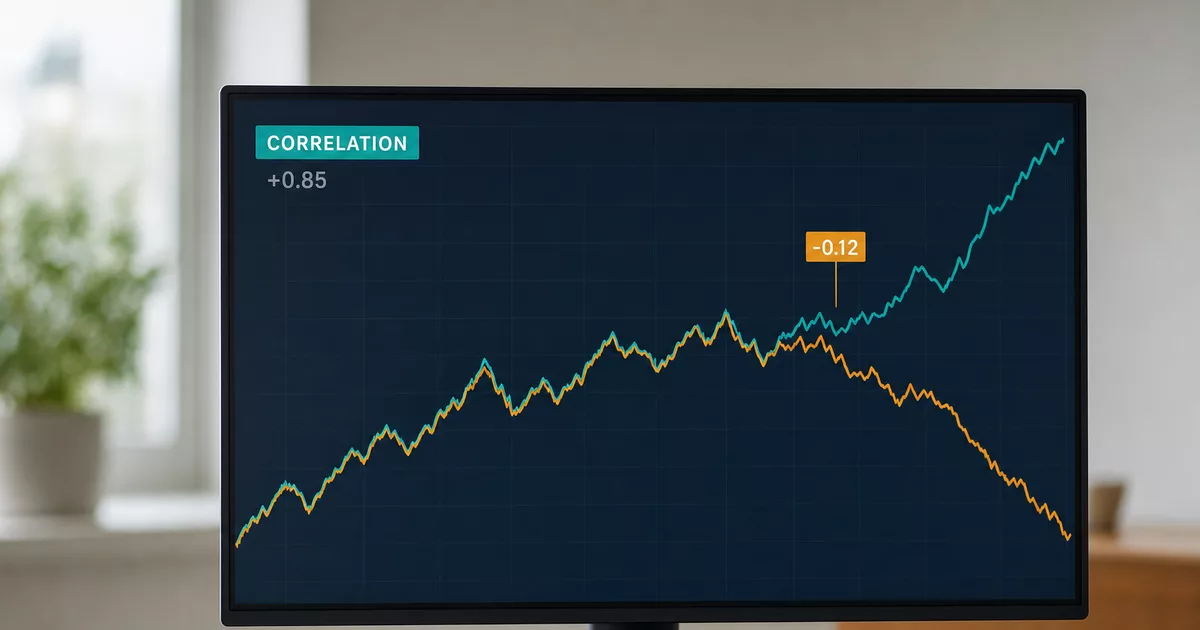
Correlation between currency pairs shows up in broker tools as one ordinary number. Behind those numbers sit two different worlds.
Some of the relationships come from the way pairs are written down. Those will never stop holding. The rest arise in the real economy, because Canada exports oil and Australia exports ore. With those, only the direction holds. The strength moves with the period, and under market stress it breaks down.
That distinction decides everything else. Almost nobody states it.
What correlation says and what it does not
Correlation is a single number between −1 and +1. It describes how closely two things move together.
A value of +1 means perfectly matched movement. A value of −1 means perfectly opposite movement. Zero means neither one drives the other. It does not mean the two have nothing in common at all.
If a tool shows you more than 1, it is calculating wrongly. Do not trust the rest of its table either. Broker tools often show the same number as a percentage, so 0.88 appears as +88%.
This is where the first common mistake comes in. A correlation of +88% does not mean two pairs move the same way on 88% of days. It is not a share of time and it is not a probability.
The second thing correlation does not tell you is the size of the move. Two assets can track each other closely while one of them moves twice as far.
Correlations have two origins
A structural correlation comes from the way the pair is written. There is no point checking whether it currently holds. The direction has to hold.
An economic correlation comes from what a country exports. The Canadian dollar and oil belong here, as do the Australian dollar and metals. Only the direction is stable. The actual number applies to the stretch of history it was calculated from and nothing more. That stretch is called the window. A different window gives a different number.
A published table with no stated period and no stated method is therefore not a finding about the market. It is one random measurement, and next time it comes out differently.
Structural links: three cases where the direction always holds
An exchange rate is a ratio. The first currency in the pair is the base, the second is the quote. A EUR/USD rate of 1.16 means one euro buys 1.16 dollars.
So in EUR/USD the dollar is the quote currency, not the base. It sounds like a detail. The whole of the rest of this article rests on it.
Sterling on opposite sides. In GBP/USD you are buying sterling, and a stronger pound means a higher number. In EUR/GBP you are paying in sterling, and a stronger pound means a lower number. If EUR/USD stands still, every rise in GBP/USD has to be matched by a fall in EUR/GBP. This is not a tendency. It is arithmetic.
The dollar on opposite sides. The same goes for EUR/USD and USD/CHF. A stronger dollar means fewer dollars per euro and more francs per dollar at the same time. A strongly negative correlation here is not showing two opposing markets. It is showing the quoting convention.
One frequently misread case belongs here too. USD/CAD and GBP/USD come out negative against each other. USD/CAD says how many Canadian dollars one American dollar costs, so it rises when the Canadian dollar weakens. GBP/USD rises when sterling strengthens. Both currencies can strengthen at once. One of those two quotes simply counts backwards. Convert it to CAD/USD and the link with GBP/USD comes out positive.
The dollar as a common denominator. EUR/USD, GBP/USD and AUD/USD all answer the same question. How many dollars does one euro, one pound, one Australian dollar cost. The dollar is the quote currency in all three pairs. When it strengthens, all three answers shrink at once.
A high correlation between those three pairs therefore says nothing about how alike the European, British and Australian economies are. You are measuring with three rulers that share a unit. And the unit has moved.
The Bank for International Settlements is where central banks pool their statistics. In April 2025 it found that the dollar sits on one side of 89% of all currency trades. Almost every trade you open is partly a bet on the dollar.
| Pair | How they move | Why |
|---|---|---|
| GBP/USD and EUR/GBP | opposite | sterling on opposite sides |
| EUR/USD and USD/CHF | opposite | the dollar on opposite sides |
| EUR/USD, GBP/USD, AUD/USD | together | the dollar is the quote currency in each |
Economic links hold the direction, not the strength
The link between the Canadian dollar and oil is documented, but weaker than the usual accounts suggest. The Bank of Canada examined the weakness of the Canadian dollar in January 2025. It explained that weakness by the gap in interest rates against the United States and by a risk premium. Oil did not come into it at all.
The Australian dollar responds to raw material prices. It can also drift away from them for a year or longer. That parting of the ways is normal behaviour, not an anomaly.
Gold and silver sit side by side in the tables like twins. Demand for them is quite different, though. Silver goes mostly into industry. With gold, a large part of demand is investment, and central banks buy it.
Then there are relationships with no mechanism behind them at all. A middling correlation between American natural gas and the pound is not a discovery. The gas price is set by domestic production, storage levels and the weather. A number like that means nothing. It appeared because two unrelated things happened to move in a similar way for a few months.
Why the numbers in published tables are often useless
Two things decide whether a published correlation means anything.
What it is calculated from. Correlation belongs on daily changes in the rate, not on the prices themselves.
A rate moves up or down from one day to the next more or less at random. Over a year that adds up to a long trend, even when nothing is driving it. Run the calculation on prices and you are mostly measuring whether both sets of numbers happened to creep the same way. Two entirely unrelated series routinely come out around 0.7 that way. You can test it in a minute in two columns in Excel.
The longer the history you take, the longer the trend that builds up in both sets. So the false number goes even higher.
The fix is simple. Calculate from daily percentage changes. You cannot assume the tool does that. Popular guides to working it out in Excel tell you to point the correlation function straight at the price columns.
How long the window is. AUD/USD and copper come out at +0.21 over the twelve months to 5 August 2026. That is a weak link. Over the last three months they come out at +0.69. That is a strong one. Same pair, same calculation date.
Anyone who picks the window to suit the story gets both answers. Short windows also jump about a great deal. A sensible minimum is two hundred trading days, roughly ten months.
What today’s data shows
No primary source publishes a finished table, so we worked one out ourselves. The period runs from 4 August 2025 to 5 August 2026. For the currency pairs, 259 daily changes went into the calculation. We work from daily percentage changes in closing rates.
The first column holds values from a correlation matrix dated December 2024, of the kind widely quoted at that time. The second is the current twelve month window and the third a shorter three month one.
| Pair | December 2024 | 12 months | 3 months |
|---|---|---|---|
| EUR/USD and USD/CHF | −0.77 | −0.86 | −0.87 |
| GBP/USD and EUR/GBP | −0.90 | −0.49 | −0.69 |
| GBP/USD and GBP/JPY | +0.88 | +0.32 | +0.54 |
| Gold and silver | +0.81 | +0.82 | +0.80 |
| WTI crude and CAD/JPY | +0.54 | +0.19 | +0.31 |
| Natural gas and GBP/USD | +0.58 | +0.13 | +0.10 |
The difference between the two kinds of link is visible directly in the table. EUR/USD and USD/CHF hold a negative value across all three measurements. What holds it is the quoting convention, not any agreement between two markets.
GBP/USD and EUR/GBP kept the negative sign too, but the tightness fell from −0.90 to −0.49. This is where the limit of structural certainty becomes visible. The necessity applies only while EUR/USD stands still. Over the past year the euro moved a great deal against the dollar and that loosened the link. The direction is a certainty. The particular number is not.
GBP/USD and GBP/JPY behave much the same way. Sterling sits on the same side of both pairs. Yet over the past year the yen mattered more to GBP/JPY than the pound did. A shared currency on its own is not enough.
The link between natural gas and sterling fell from +0.58 to +0.13. There is no mechanism between the two and the original value was coincidence.
Oil is the most telling case. The Canadian dollar is the quote currency in USD/CAD, so a link between oil and the Canadian dollar would show up as a negative number. Over twelve months it comes out at −0.04, effectively nothing. The link that almost every piece about commodity currencies repeats is not in the past year of data.
Commodities and currencies
Run the same calculation on commodities and even among them the relationships are less obvious than the usual accounts suggest.
| Pair | 12 months | 3 months |
|---|---|---|
| Gold and silver | +0.82 | +0.80 |
| Silver and copper | +0.64 | +0.81 |
| AUD/USD and copper | +0.21 | +0.69 |
| WTI crude and USD/CAD | −0.04 | −0.19 |
| WTI crude and USD/NOK | −0.07 | −0.18 |
| WTI crude and natural gas | +0.10 | +0.16 |
Gold and silver stay together in both windows. Silver is an industrial metal as well, though, so it moves with copper too. Over the past three months it did so more tightly than with gold.
The Norwegian krone ends up in the same place as the Canadian dollar on oil. The link that a clearly negative number would show is not in the data. Both central banks say as much. Norges Bank notes that the krone is weaker than the oil price would imply under its own model. It also reports that the oil sector’s share of the Norwegian economy has mostly been shrinking since 2014.
Oil and natural gas are both energy, and still they do not move together. Oil trades globally, while the gas price is set by domestic production, storage levels and the weather. Gas is essentially a local price and oil is a world one.
The Australian dollar and copper are the best illustration of how the window changes the conclusion. Weak over twelve months, strong over three. Same pair, same calculation date.
The values hold as at the calculation date and will keep changing. The December 2024 numbers no longer apply, and that is precisely the point of this article.
Three positions, one bet
The most common practical mistake is to treat a strong correlation as a chance to spread risk. It works the other way round. A strong correlation is a warning that two positions are one bet.
Going long EUR/USD, GBP/USD and AUD/USD looks like three trades across three continents. But the dollar is the quote currency in all three pairs. It is one bet against the dollar split over three tickets and paid for with three spreads.
The maths can be done exactly. Three unrelated positions partly cancel each other out, because one is winning while another is losing. The swing on the whole account is therefore not three times one position but roughly 1.7 times it. Once the pairs move almost identically, the cancelling disappears and you are at 2.8 times. With a perfect match you simply hold one position three times the size.
The same logic runs the other way. Long EUR/USD and short GBP/USD is not a separate extra bet. It is a position in EUR/GBP paid for with two spreads.
And buying EUR/USD alongside USD/CHF is not a hedge against dollar risk. It is an open position in EUR/CHF. That is what wiped out accounts on 15 January 2015, when the Swiss National Bank abandoned the floor under the franc against the euro.
Correlations fall apart in a crisis
Numbers measured in a calm period do not describe how a portfolio behaves under stress.
March 2020 showed this best. Between 9 and 18 March the gold price fell by 12%. It dropped alongside shares. American and British government bonds fell too, the other classic safe haven. In that one week almost everything that was meant to hold went down.
Gold had not lost its role. Investors were after cash and sold whatever could be sold fastest. Not whatever made least sense to hold.
The dollar pairs parted company with each other as well. Against the Norwegian krone and the commodity dollars the dollar strengthened sharply. Against the euro it barely moved. Against the yen and the franc it weakened instead. The assumption that all pairs against the dollar move together failed even on the sign.
So calculate the same pair twice. Once over the most recent calm period and once over March 2020. The gap between those two numbers is what will catch you out one day. Set your position size by the worse of them.
Where to get current numbers
The data is free at the primary sources. The European Central Bank publishes euro reference rates every working day and the history can be downloaded as a table.
The American Fed puts out daily rates in a release known as the H.10 statistic. The same data sits in FRED, the public American statistics database.
The procedure is the same for every pair. Take two columns of rates and work out the daily percentage changes. In Excel you then run the CORREL function on them. Note the period, the length of the window and the number of observations alongside the result.
Rates from different sources should not be mixed. Each one takes its snapshot at a different time of day. The ECB does so in the early afternoon central European time, the Fed at midday in New York. Mix them and you are calculating changes over unevenly long stretches of the day.
With a finished broker tool, look for two things. Whether the length of the window can be set. And whether the source states what the correlation is calculated from. When the method is missing, take no more from the result than whether it carries a plus or a minus.
For structural pairs that hardly matters, because their direction holds regardless of what the table shows. For economic links it is worth working the number out yourself. And doing it over a window that matches the horizon of your trade.