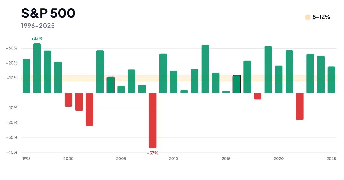
Ask how much the American stock index earns and one number comes back everywhere: about ten percent a year. The number is right. What makes it misleading is everything usually left unsaid beside it — whether it includes dividends or not, whether it comes before or after inflation, and what a year actually looks like in which the index really does deliver those ten percent.
The answer to that last one is unexpected. Such a year barely exists. Over the past thirty years, exactly two finished in the eight-to-twelve-percent band.
How much the index earned in a hundred years
The longest series that can sensibly be used for American stocks starts in 1926. Back then the index sat at around 12.65 points. At the end of 2025 it closed at 6,845 points.
Anyone who put in a hundred dollars at the start of 1926 and sent every dividend back into the index would hold roughly $2.2 million by mid-2026. That works out at 10.5% a year.
Except a 1926 dollar and a 2026 dollar are not the same thing. Adjusted for inflation, those 10.5% become 7.3% a year — still an excellent result, but a third lower than the way the index is usually sold.
And third: had the same person spent the dividends instead of reinvesting them, the index level alone would have grown by only about 6.5% a year. The near four percentage points of difference come not from rising share prices but from reinvested dividends. Over a century they produce most of the final sum, because they compound along with everything else — without reinvestment, that hundred dollars would have turned into something on the order of fifty thousand rather than two million.
Those three numbers — 10.5%, 7.3% and 6.5% — describe one and the same index. They differ only in what they count as return. Most arguments about “how much the S&P 500 really earns” are in fact arguments about a definition.
The average year barely exists
Here is the most useful thing that can be said about the average return: as a forecast for any single year it is worthless.
Take the past thirty years, 1996 to 2025, and work out the annual returns including dividends. The average comes to 10.4% a year. Yet only two years out of thirty fell in the 8–12% band — 2004, at 10.88%, and 2016, at 11.96%. The other twenty-eight finished somewhere else, usually a long way from it.
Six years were losing ones. The worst, 2008, took 37% away; the best, 1997, added 33%. The median for the period is 15.9%, five and a half percentage points above the average — which only tells you that a handful of years with deep crashes drag the whole result down.
The average describes a century of movement, not a year. Anyone expecting the index to credit them ten percent every year gets thirty percent and minus twenty in turn instead.
Why the same index comes with different numbers
Beyond dividends and inflation there is one more difference that few people notice — whether the average is calculated arithmetically or geometrically.
The arithmetic mean of annual returns over the past thirty years is 11.9%. The actual growth of the money over the same period, though, is 10.4% a year. That gap of one and a half percentage points is not an error in the data but a mathematical consequence of the swings.
Two years are enough to show it. If an investment falls 50% one year and rises 50% the next, the arithmetic mean is zero, yet a quarter of the money is missing: a hundred dollars becomes fifty, and fifty becomes seventy-five. The more the value swings, the wider the gap between the average and reality.
The practical upshot is simple. Only the lower, geometric figure is usable for planning. The arithmetic mean overstates the result the wilder the period it describes.
Year by year over the past fifteen years
The table below shows the closing level of the index at the end of each year and its change in two forms — without dividends, as the price chart shows it, and with dividends reinvested, as an investor experiences it.
| Year | Index close | Change without dividends | Change with dividends |
|---|---|---|---|
| 2025 | 6,845.50 | +16.39% | +17.88% |
| 2024 | 5,881.63 | +23.31% | +25.02% |
| 2023 | 4,769.83 | +24.23% | +26.29% |
| 2022 | 3,839.50 | −19.44% | −18.11% |
| 2021 | 4,766.18 | +26.89% | +28.71% |
| 2020 | 3,756.07 | +16.26% | +18.40% |
| 2019 | 3,230.78 | +28.88% | +31.49% |
| 2018 | 2,506.85 | −6.24% | −4.38% |
| 2017 | 2,673.61 | +19.42% | +21.83% |
| 2016 | 2,238.83 | +9.54% | +11.96% |
| 2015 | 2,043.94 | −0.73% | +1.38% |
| 2014 | 2,058.90 | +11.39% | +13.69% |
| 2013 | 1,848.36 | +29.60% | +32.39% |
| 2012 | 1,426.19 | +13.41% | +16.00% |
| 2011 | 1,257.60 | 0.00% | +2.11% |
The difference between the two columns runs at roughly two percentage points a year. That is the dividend yield of the index — unremarkable on its own, decisive over a long horizon.
Note 2011 as well, when the index finished within a hundredth of where it started. Zero without dividends, two percent with them.
What the hundred-year curve really shows
A chart of the index over a hundred years usually sits on an ordinary vertical axis. It then looks as though almost nothing happens until the nineties and a rocket launch follows. From that people often conclude that stocks only started earning properly a short while ago.
That impression is largely an artifact of the axis.
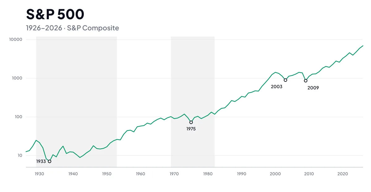 The level of the S&P Composite in January of each year, without dividends and in nominal prices. Each division of the vertical axis is a tenfold step. The years marked are the bottoms after the biggest crashes, the gray bands two long stretches of stagnation.
On a logarithmic axis, where the same percentage change takes up the same height no matter what level it is measured from, the steep end turns into a much gentler climb. Between 1926 and 1986 the index rose sixteenfold — but on an ordinary axis that stretch merges with zero, because in absolute points it is negligible next to today.
That does not mean the index climbed evenly. Two long plateaus stand out. It did not get above its January 1929 level until January 1953, twenty-four years later. And between January 1969 and January 1982 it added a combined 15% over thirteen years. Both in nominal prices; after inflation the seventies were considerably worse.
Compounding is not working any harder in recent decades than it did in the forties. It works the same as ever; it simply works on a far bigger base, which makes its result in absolute numbers incomparable. The steep end of the curve is no sign that today’s market is growing faster.
Where to run the numbers on your own amount
Worked examples of the “if you set aside three thousand a month” sort always rest on someone else’s inputs — someone else’s amount, someone else’s horizon and someone else’s expected return. Putting in your own is more useful.
That is what our compound interest calculator is for: set the monthly contribution, the period and the annual return, and watch how the result moves. If you feed it the return of the S&P 500, work with seven percent after inflation rather than ten percent nominal — otherwise the calculator hands you a sum in money that will have different purchasing power in thirty years.
The practical side — which product tracks the index and which companies carry the most weight in it — is a subject of its own. Worth knowing anyway: the concentration in a handful of the largest names is higher today than it used to be.
What the S&P 500 actually is
The index brings together 500 American companies, picked by a committee on size, liquidity and other criteria. Because some firms have more than one class of shares, 503 tickers are in fact tracked. Weights follow market capitalization, so the largest companies move the index the most.
It helps to know where the hundred-year data comes from. The index in its present form of five hundred companies was born on 4 March 1957. Before it, from 1926, there was a narrower index of ninety stocks calculated daily, and from 1923 a broader but only weekly series. So when returns going back to the twenties are quoted, that is a chain of several indices, not a hundred years of one and the same calculation.
Conclusion
The average annual return of the S&P 500 is roughly 10.5% with dividends, 7.3% after inflation and 6.5% if dividends are left out. Which of those is “the right one” depends entirely on what you are asking.
More important than the exact value, though, is the spread around it. The average describes a hundred years, not next year — and over the past thirty years only two of thirty came close to it. Anyone counting on the index for a steady ten percent payout is expecting something history has never delivered. Anyone who accepts that the road to the average runs through years down thirty percent has their expectations set by the data.
The figures in this article are based on the closing levels of the S&P 500 and its total-return version including dividends, supplemented by Shiller’s historical series for the period before 1988.